
Residential Case Study
Trifecta Verde En Resplandor
Quiet warmth, carried faithfully from concept to completion.
Project at a Glance
A calm home for a family of four
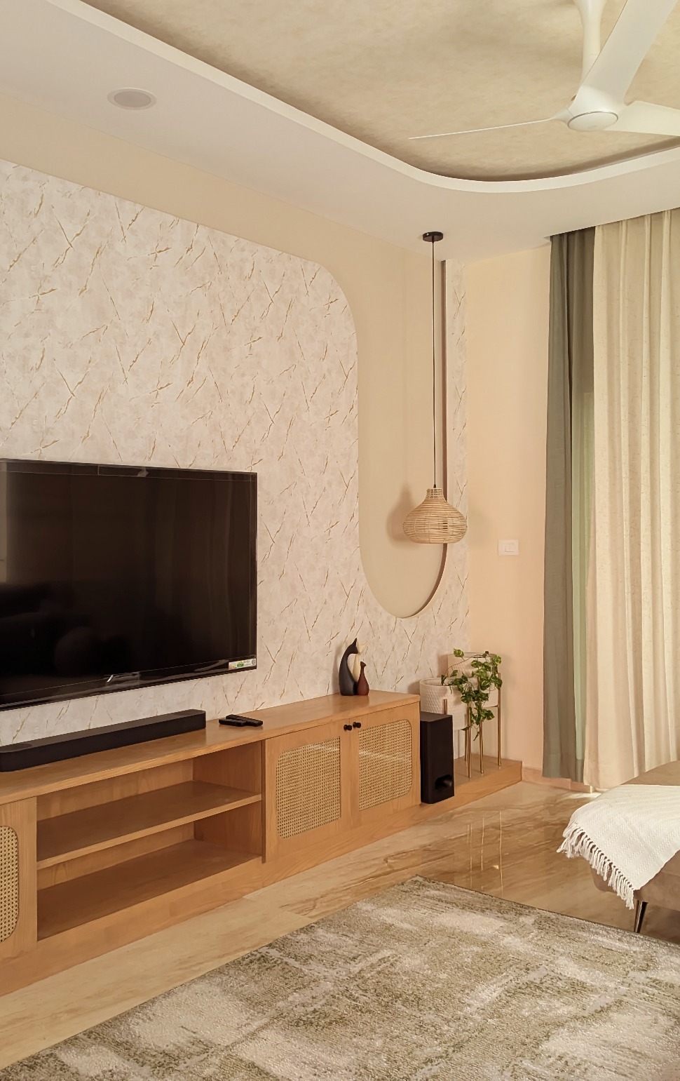
The client and his family wanted their three-floor villa to feel light, composed and enduring. With twin children and distinctly quiet tastes, the brief called for a white, beige and neutral palette - never bold, never cold. He is also deeply fond of accessories and the emotional layer they bring to a home.
The design challenge was to create identity without relying on strong colour - and then preserve that intent through execution. The comparisons in this study place the approved rendered image beside the actual completed photograph, making the design-to-site accuracy visible.
Design Strategy
Character through form, texture and light
White, cream and beige create continuity across all three levels.
Arches, rounded joinery and soft profiles add personality without visual noise.
Wood tones, woven surfaces and tactile finishes keep the neutral palette grounded.
Cove, task and accent lighting shift the spaces from pale to inviting.
Ground Floor / Living + Dining
One visual language, two everyday zones
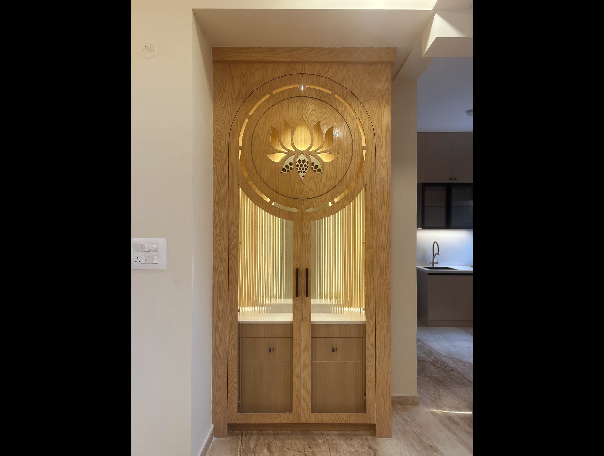
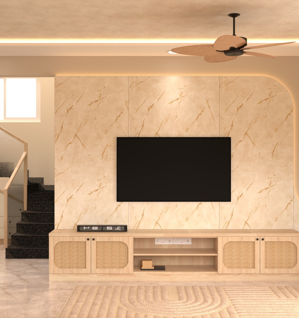
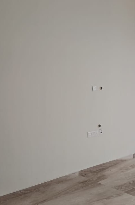
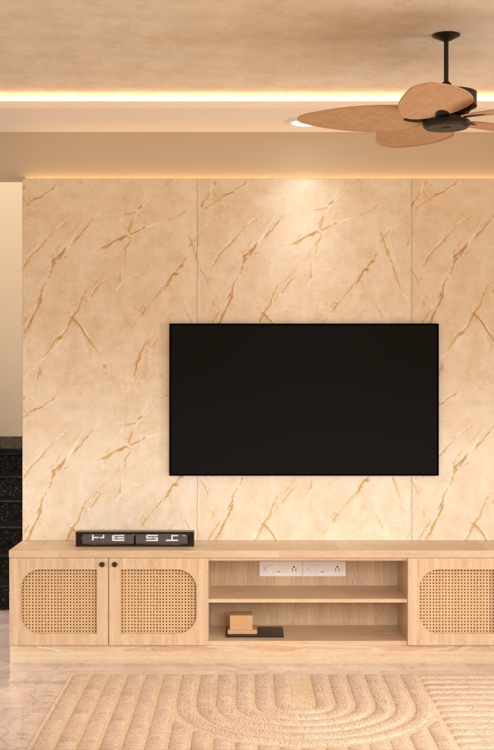
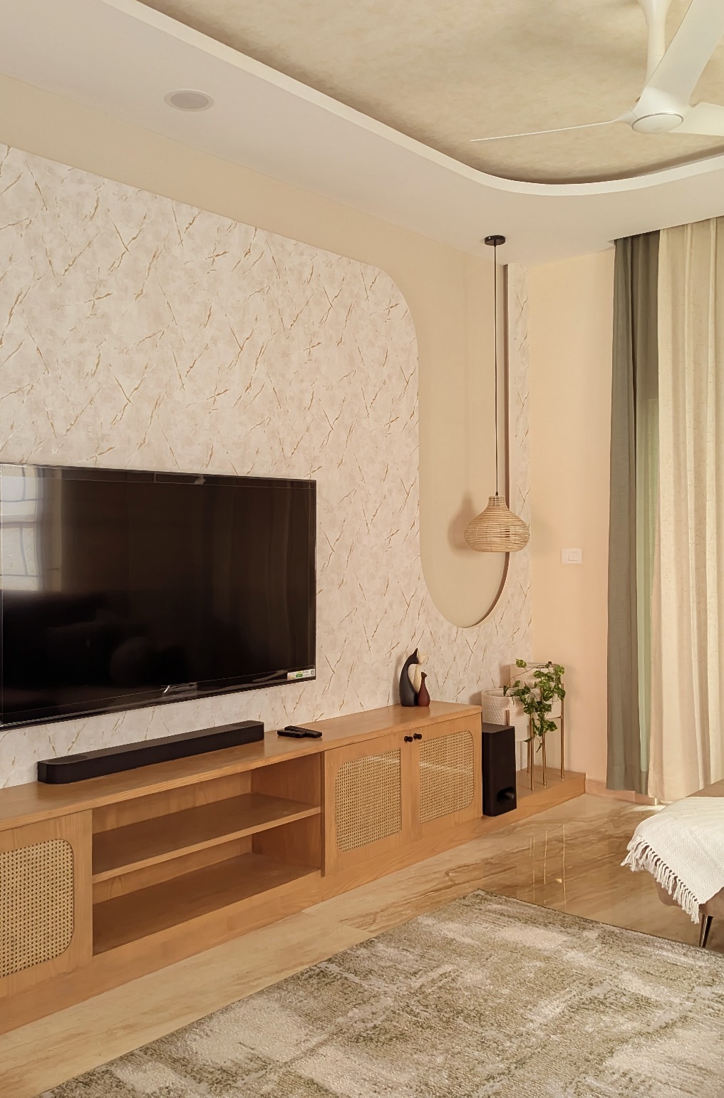
The sculpted TV wall, slim storage, warm timber base and curved ceiling profile were resolved in 3D before site work began. The completed photograph shows how closely those proportions, finishes and lighting lines were retained.
Rendered vs Actual Execution
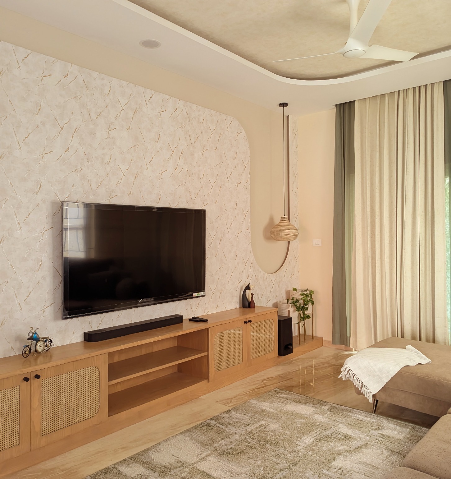
What Remained Consistent
TV-wall geometry / marble-look backdrop / low storage proportions / curved ceiling line / warm neutral balance
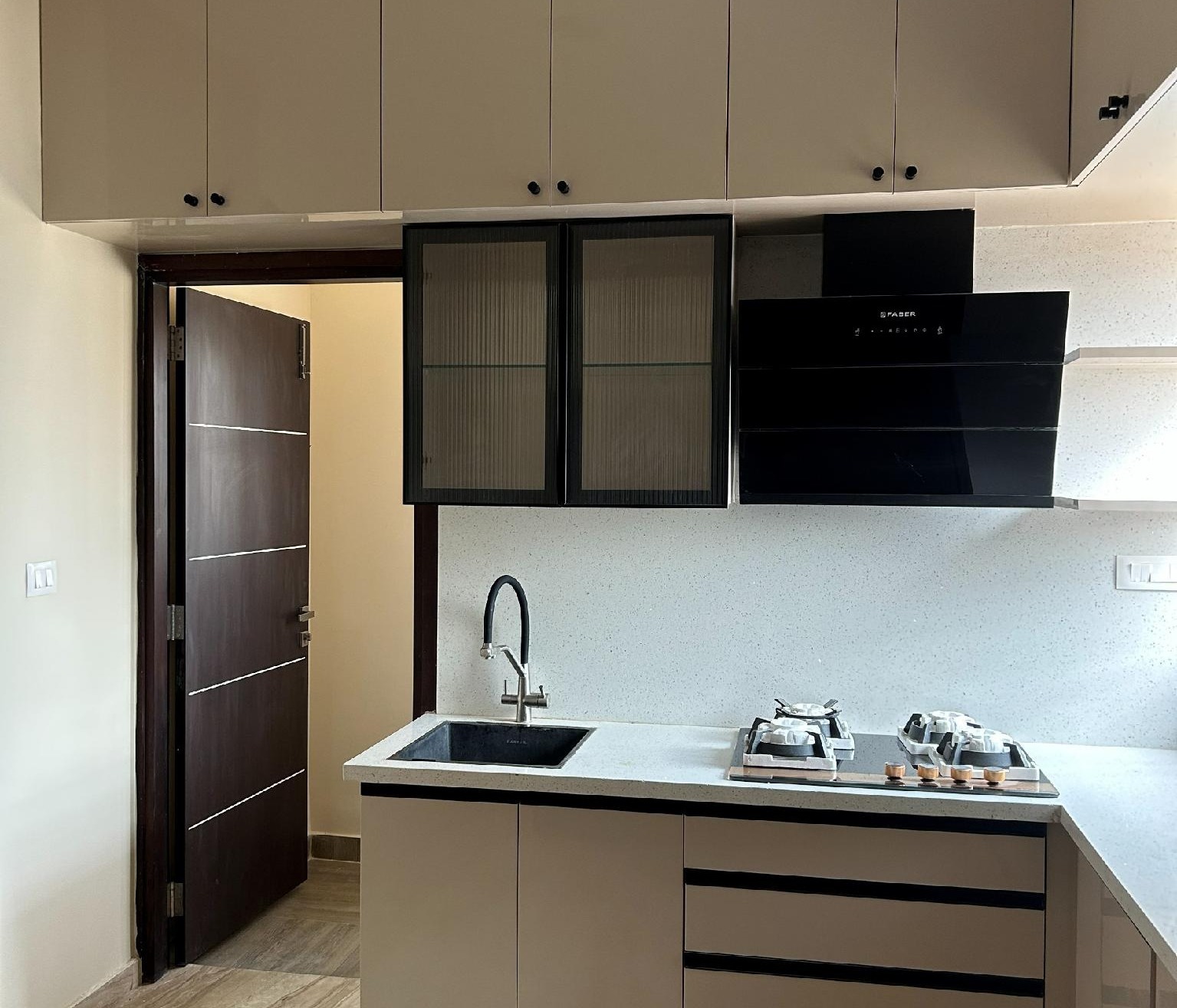
Kitchen / Rendered vs Actual Execution
Precision within a quiet palette
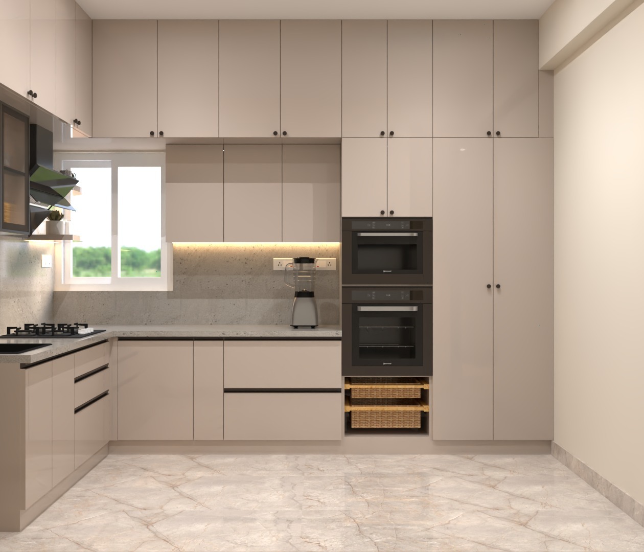
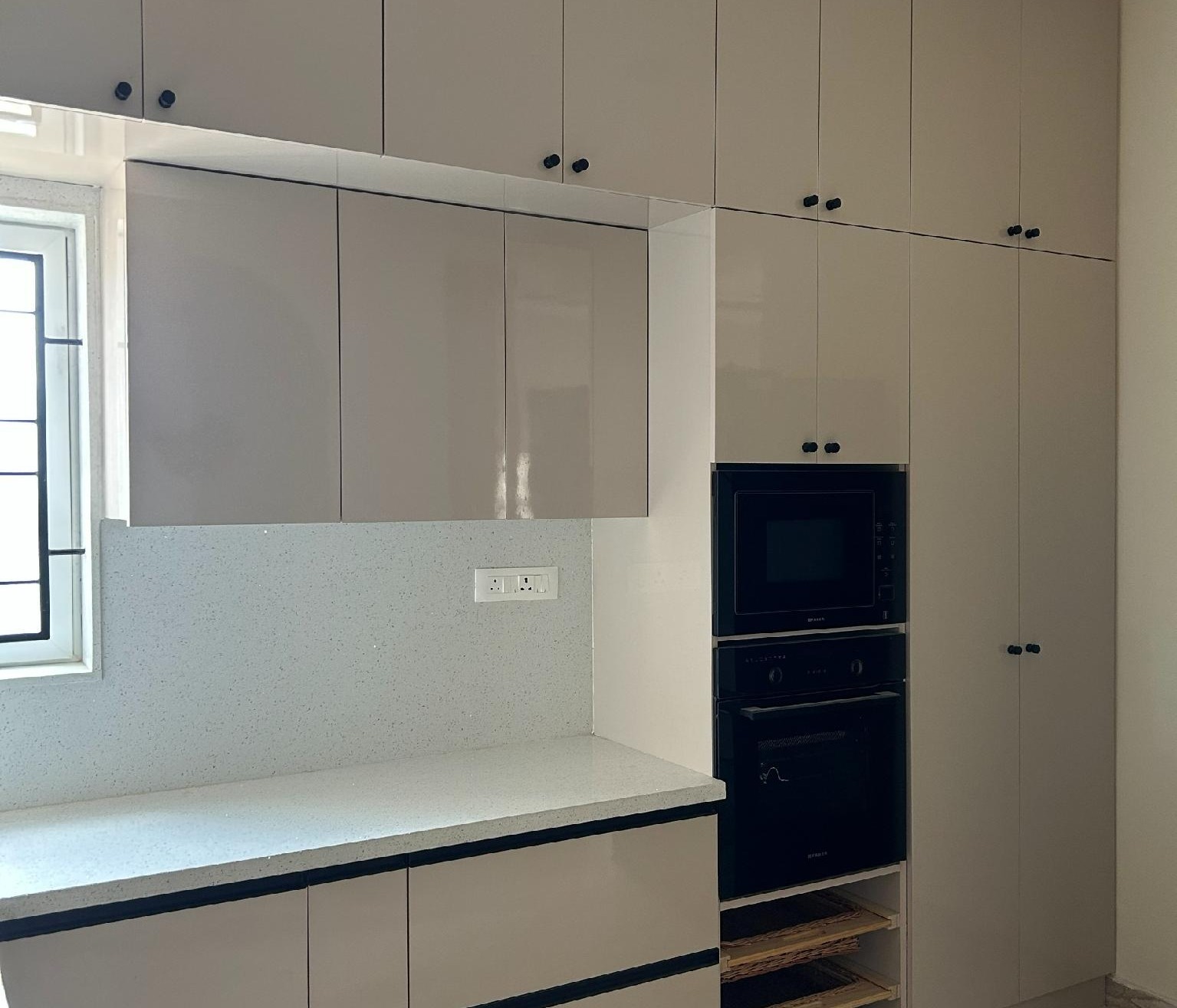
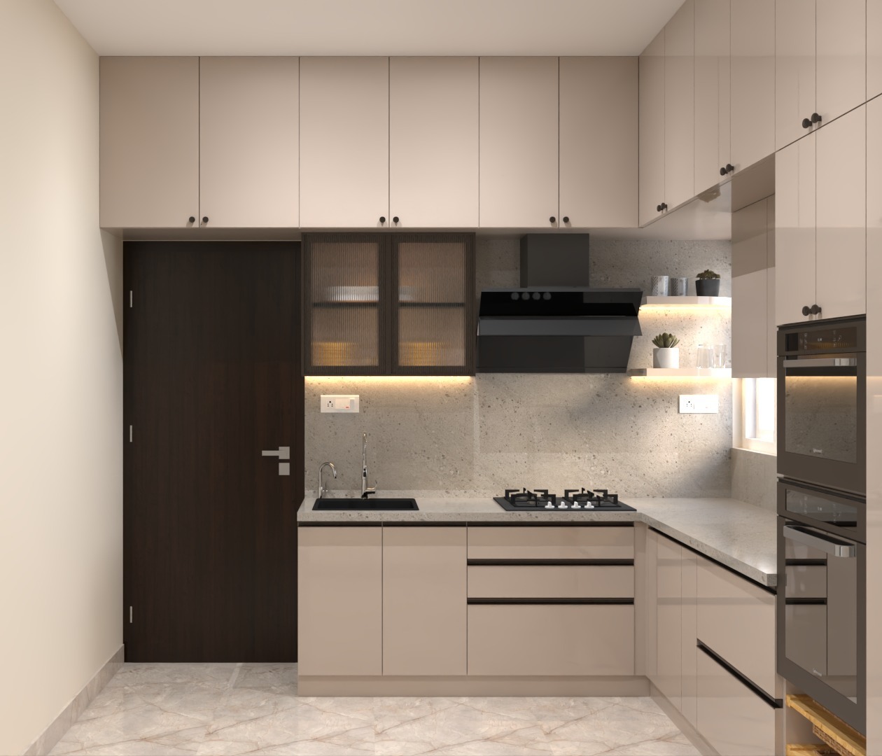
The kitchen comparisons demonstrate execution accuracy in two views. Cabinet divisions, appliance positions, counter lines and the taupe-white balance remain recognisable from the approved render to the completed site.
Twin Bedrooms / Rendered vs Actual Execution
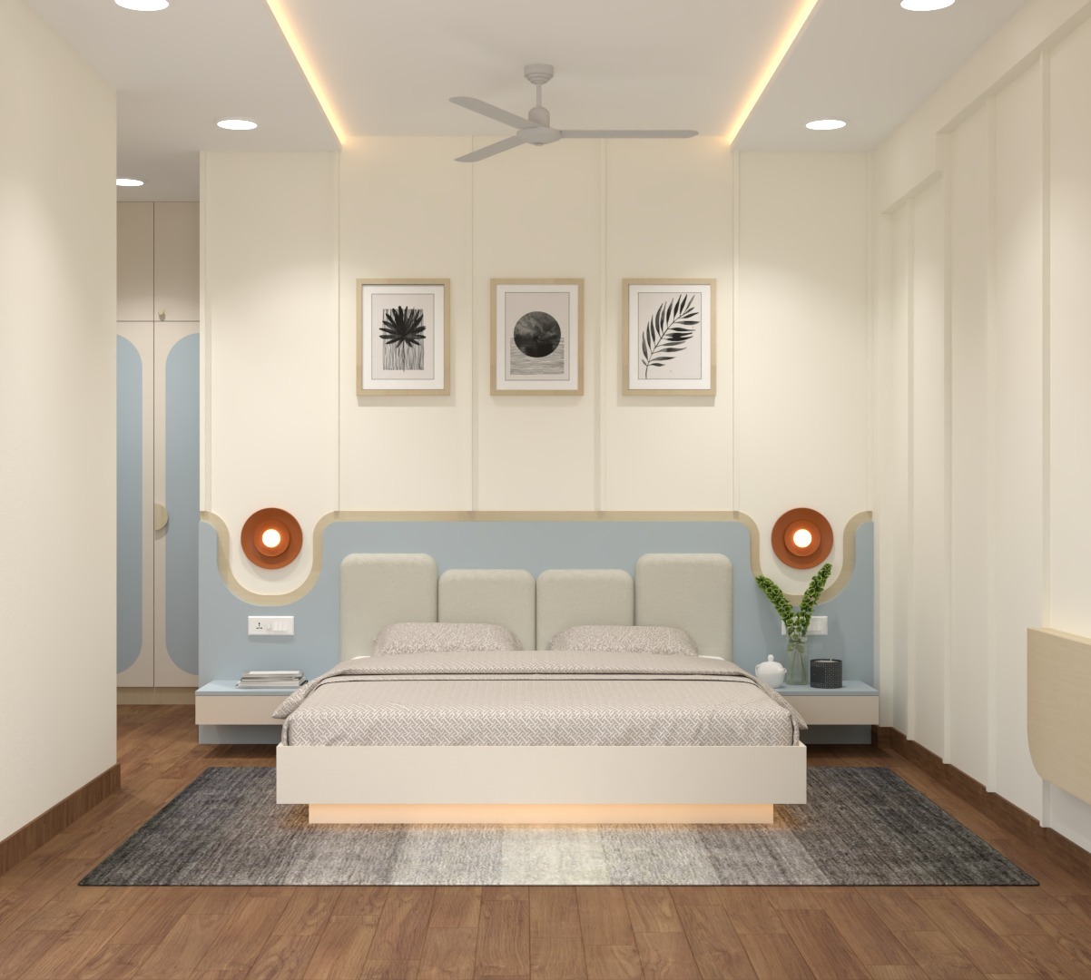
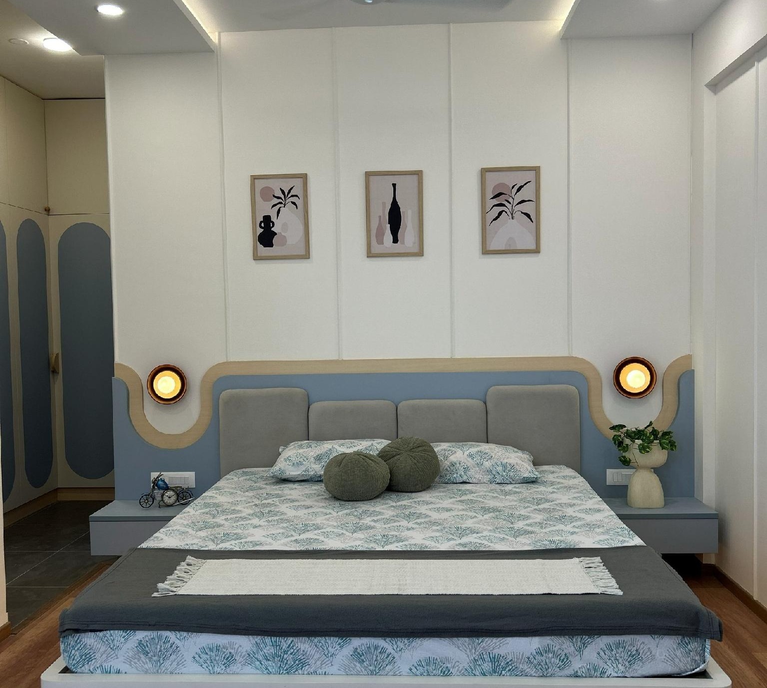
Related, not identical
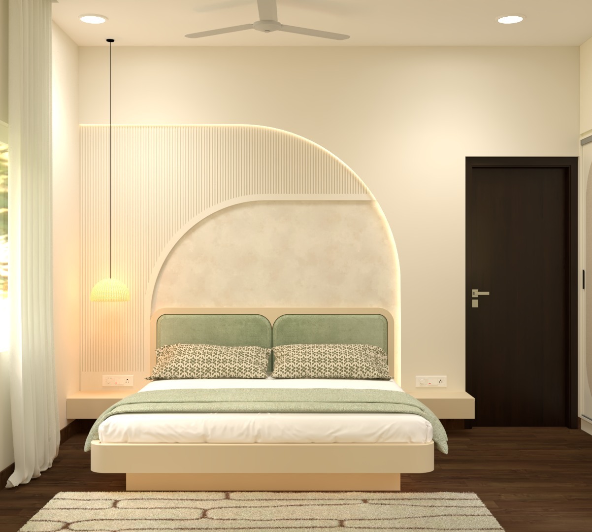
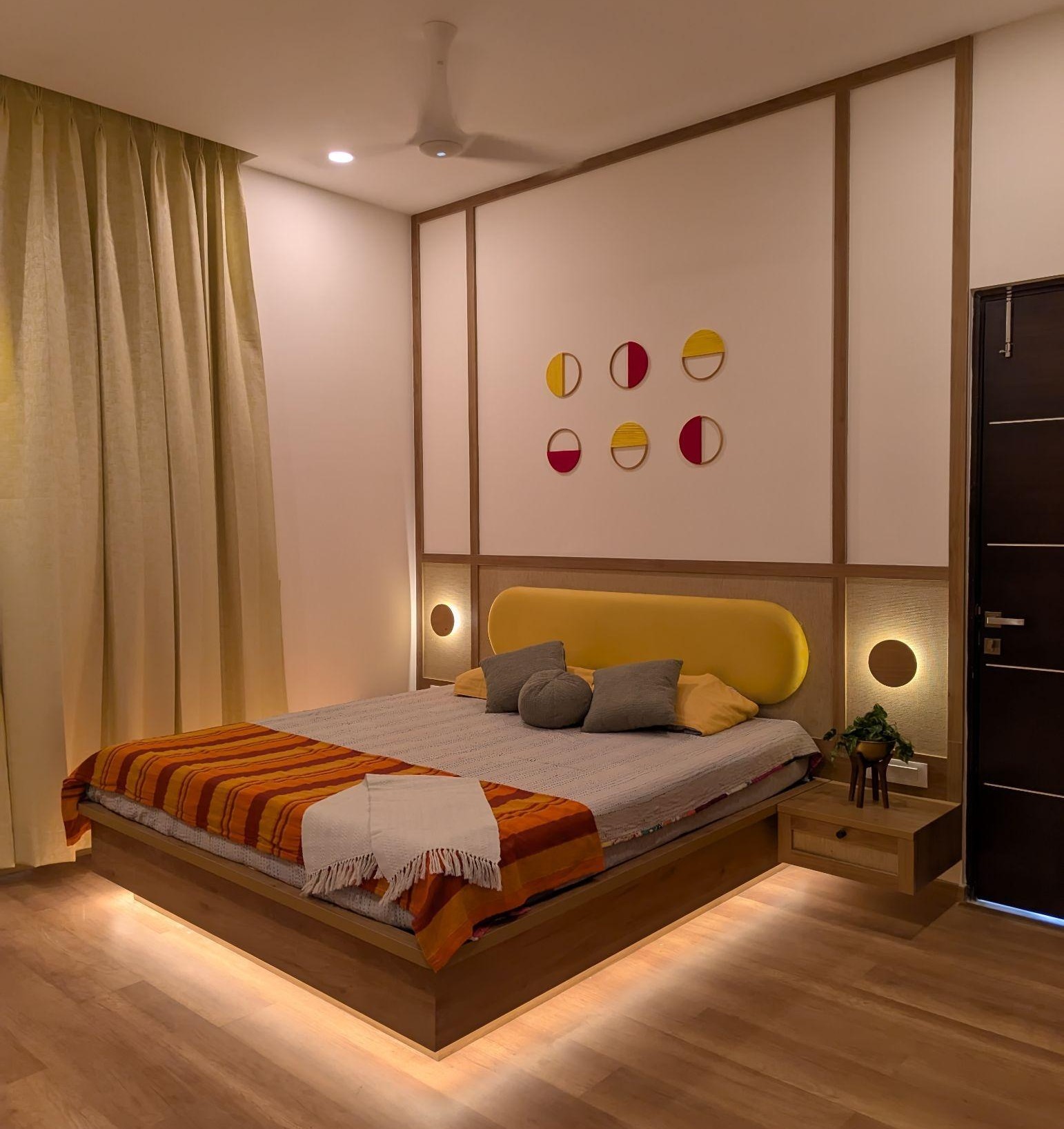
The twins’ rooms share the home’s neutral foundation, but each is given a distinct rhythm. Muted blue, sage, warm timber flooring and playful geometry create age-appropriate rooms without depending on loud colour or short-lived themes.
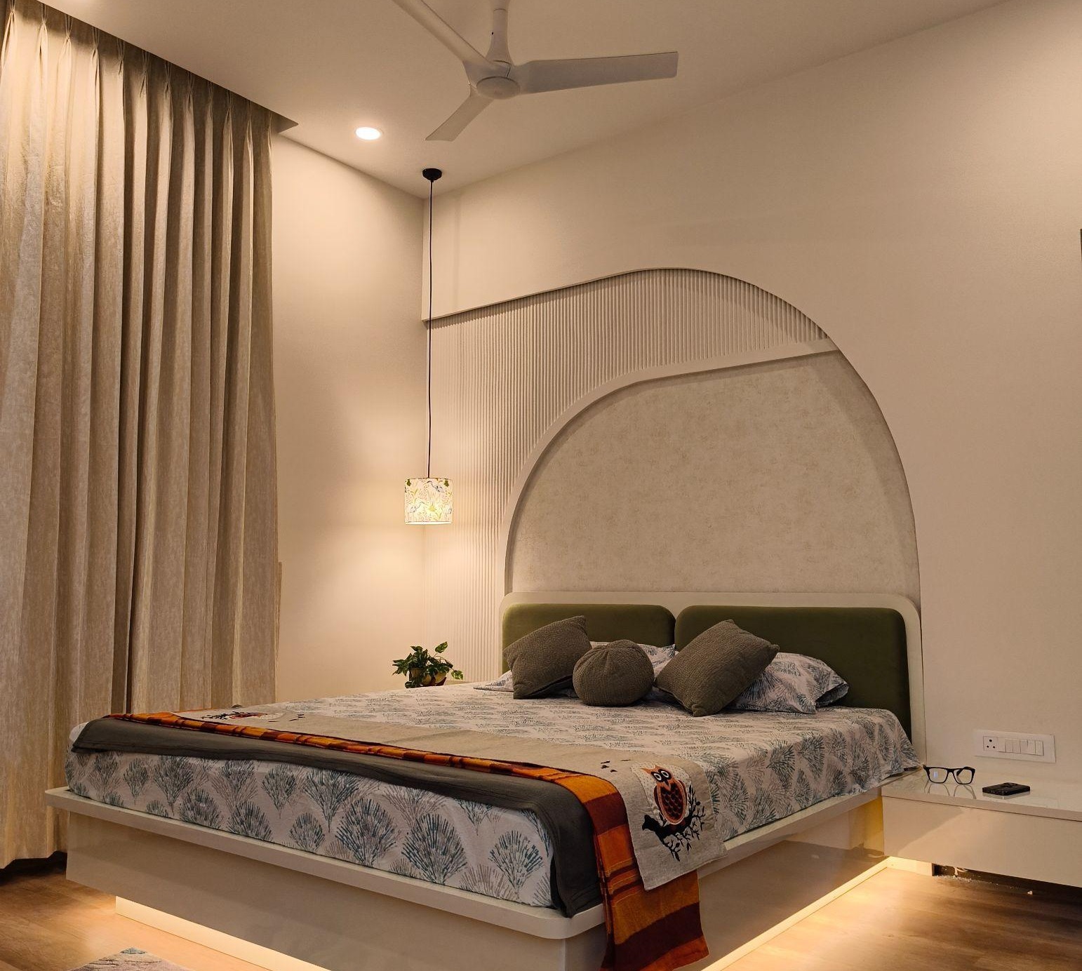
Joinery / Rendered vs Actual Execution
Storage becomes part of the architecture
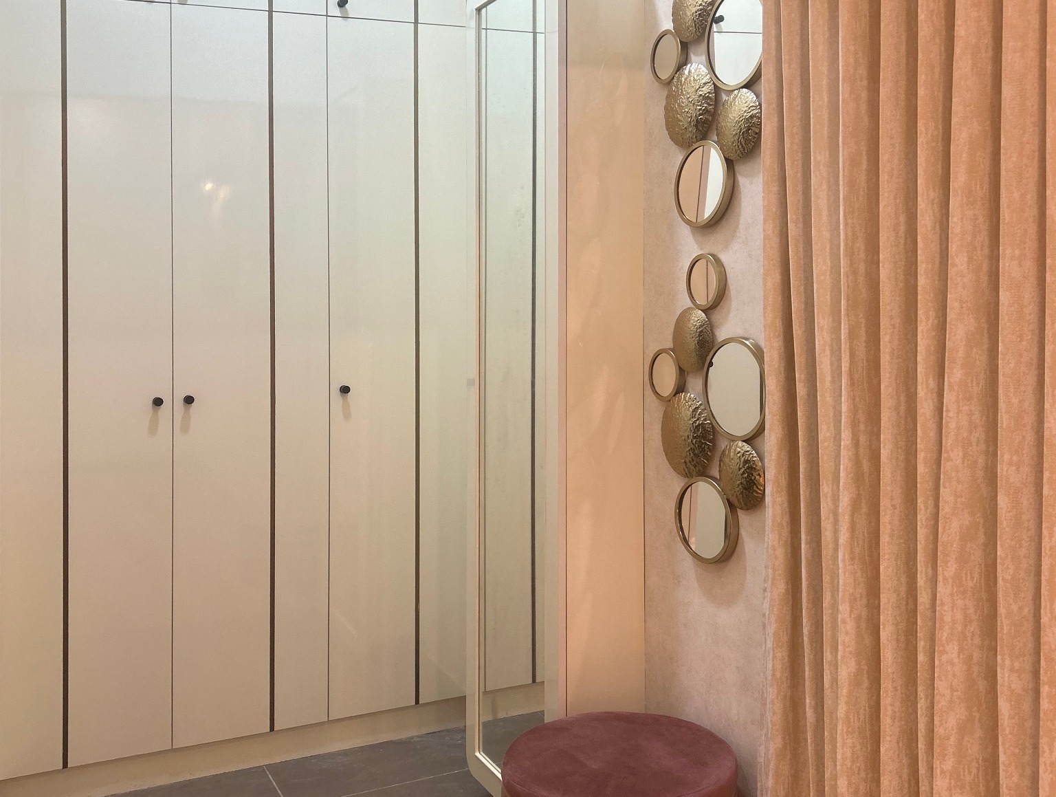
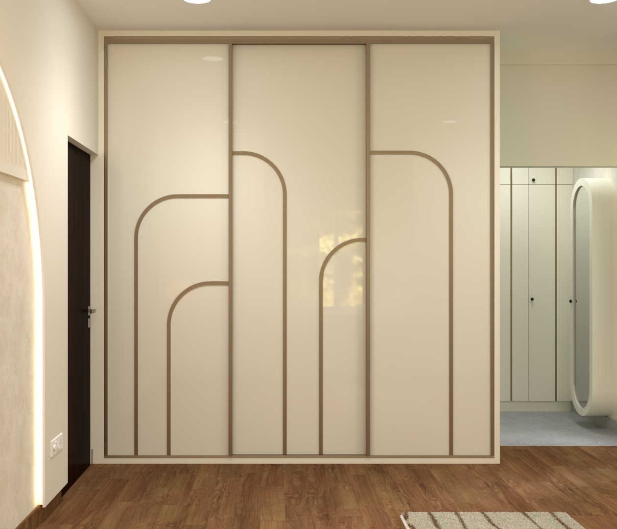
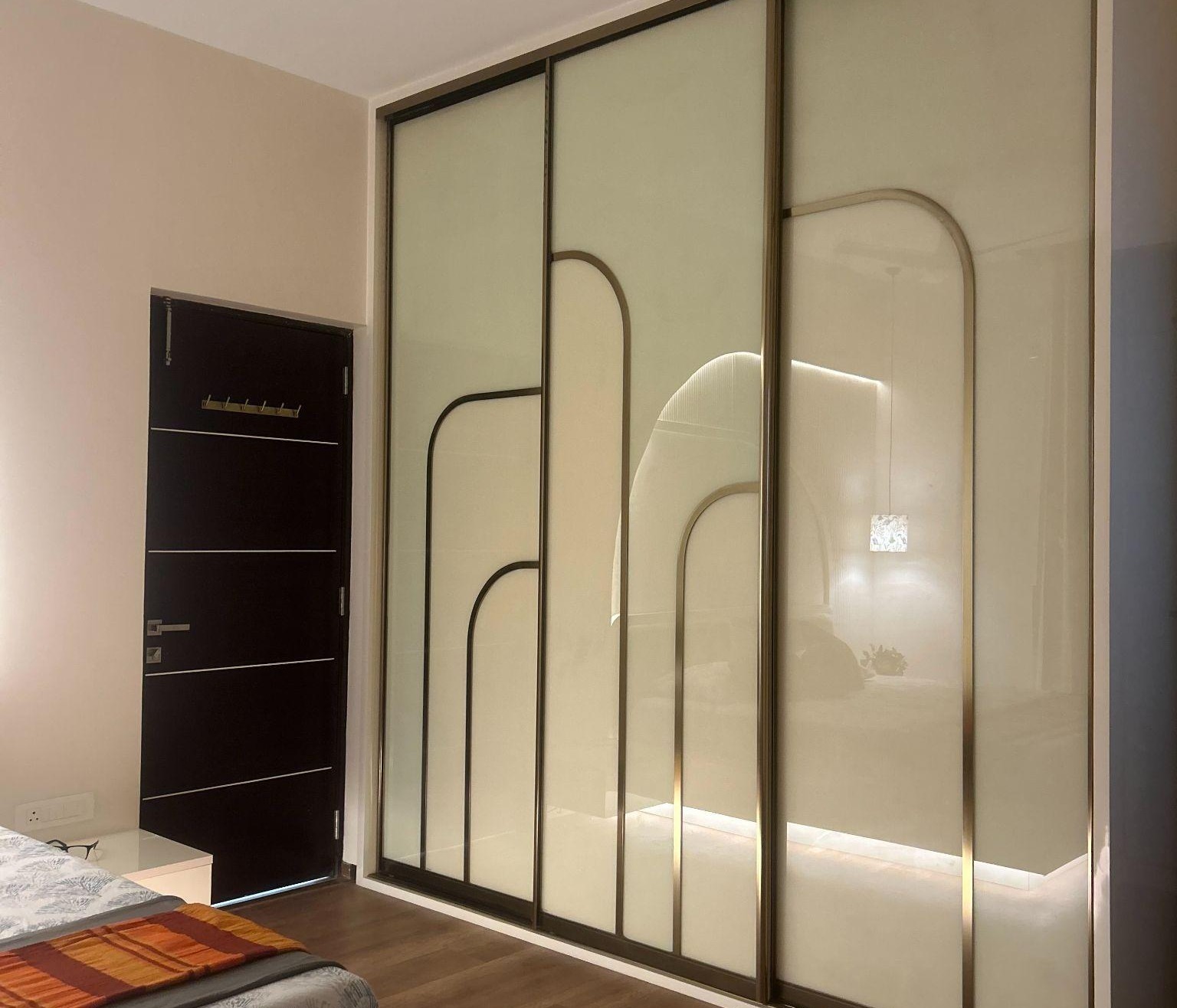
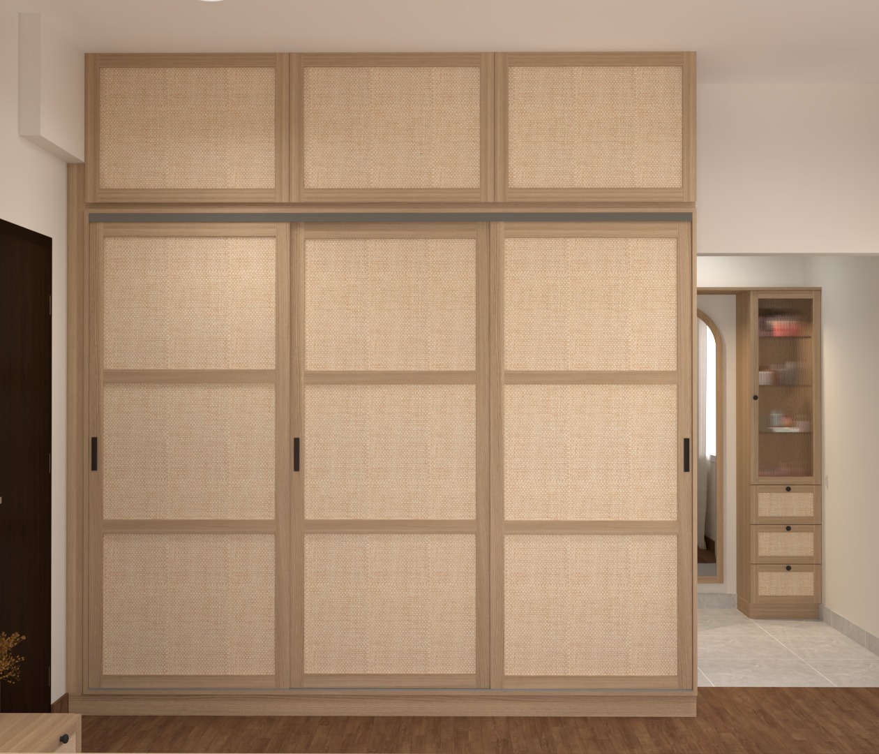
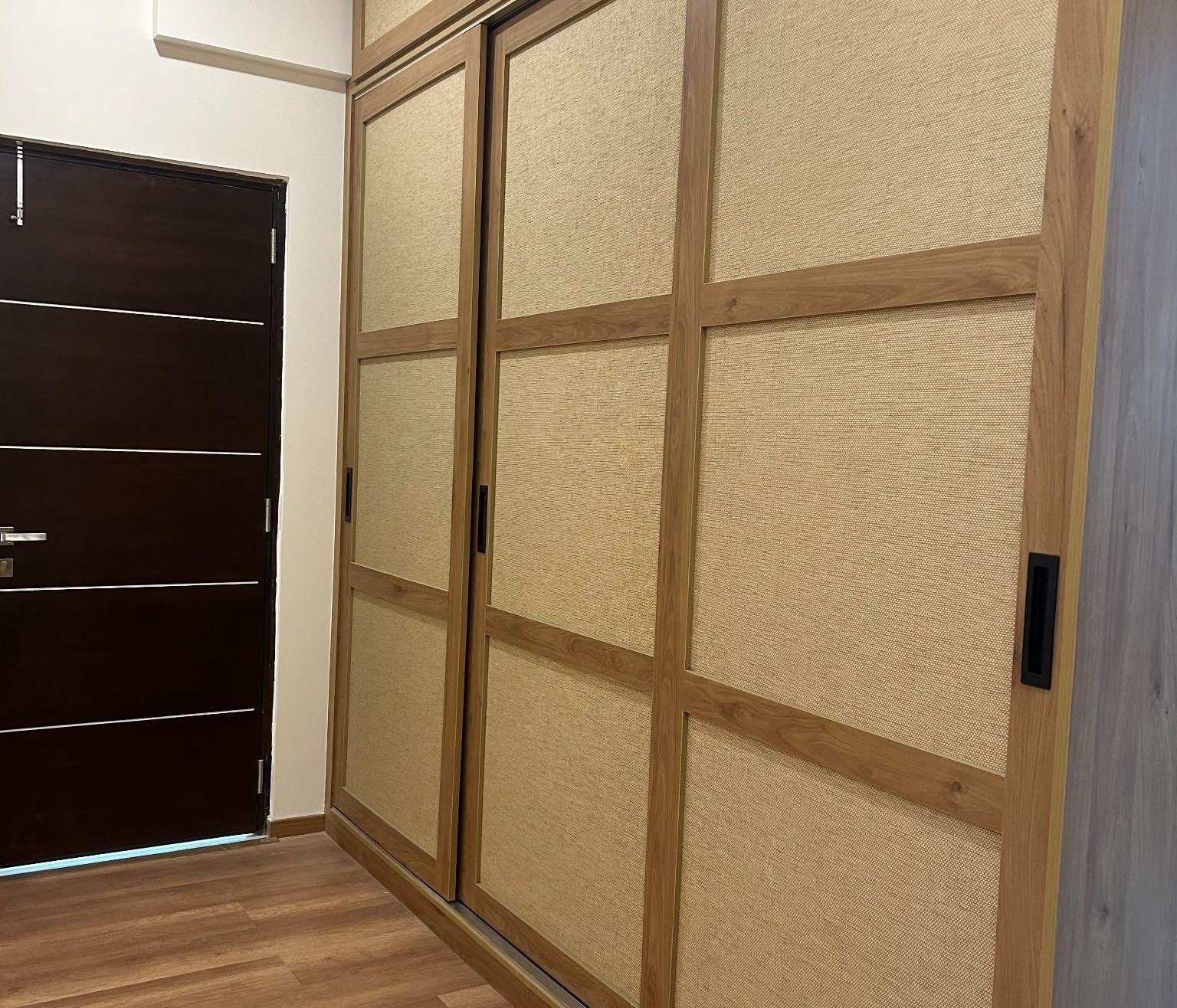
The accuracy is visible even in custom joinery. Arched inlays, frame widths, panel rhythms and woven surfaces were not improvised at site; the executed wardrobes closely follow the approved elevations.
The Emotional Layer
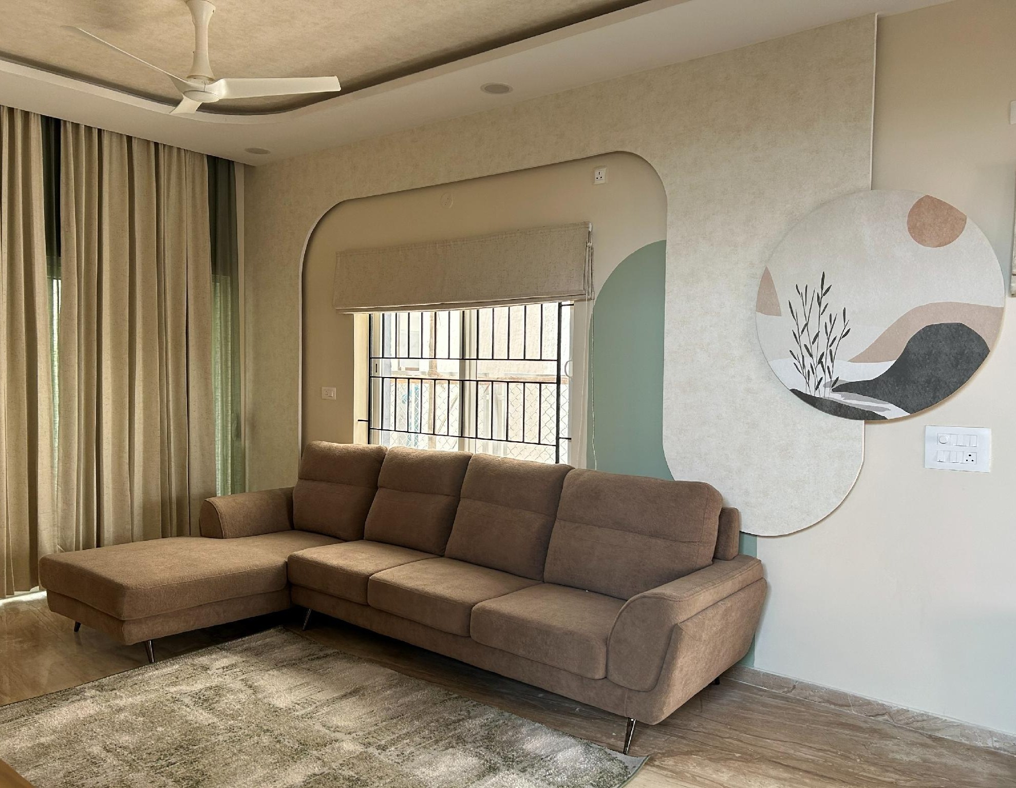
Designed to hold stories, not just furniture
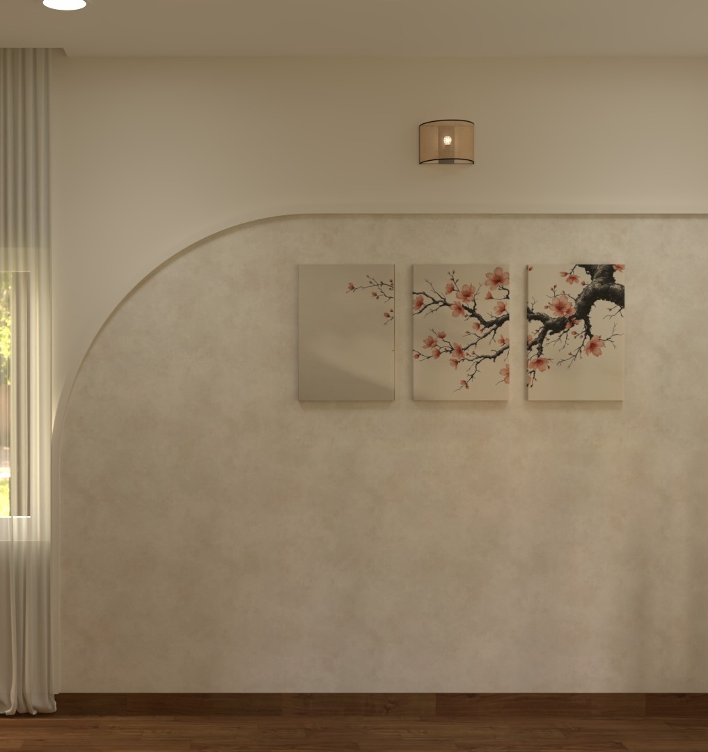
For the client, accessories are not finishing touches added at the end. They are what turn a well-designed space into a home. The neutral architecture was therefore kept intentionally composed: a backdrop for art, objects, collected pieces and the small memories a family builds over time.
Art, Objects and Family Identity
Calm Rooms Leave Space for Life
Home Office + Lounge / Rendered vs Actual
A place for focus. A place to gather.
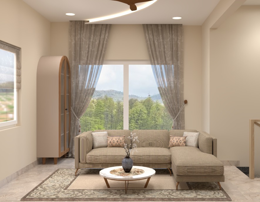
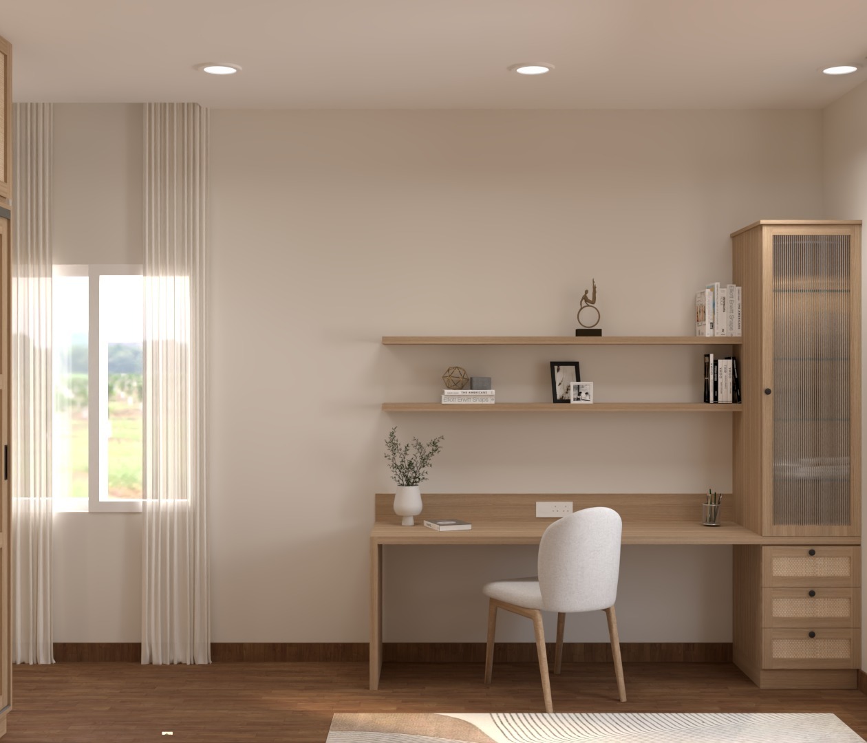
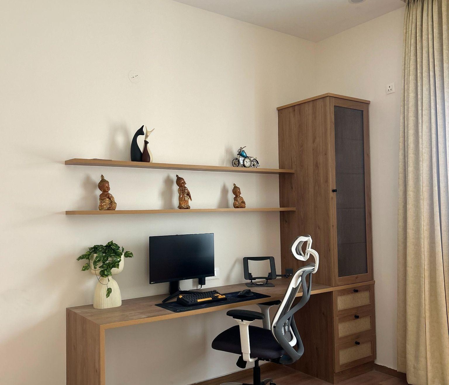
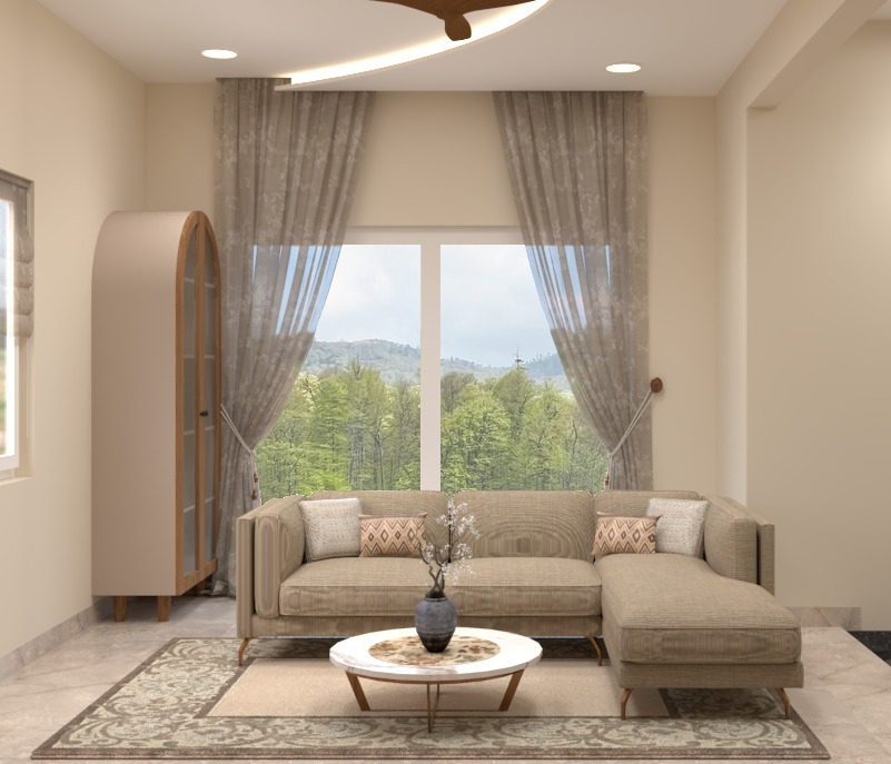
The comparison extends beyond formal rooms. The compact office and upper lounge both retain their planned furniture placement, joinery language and neutral warmth after execution.
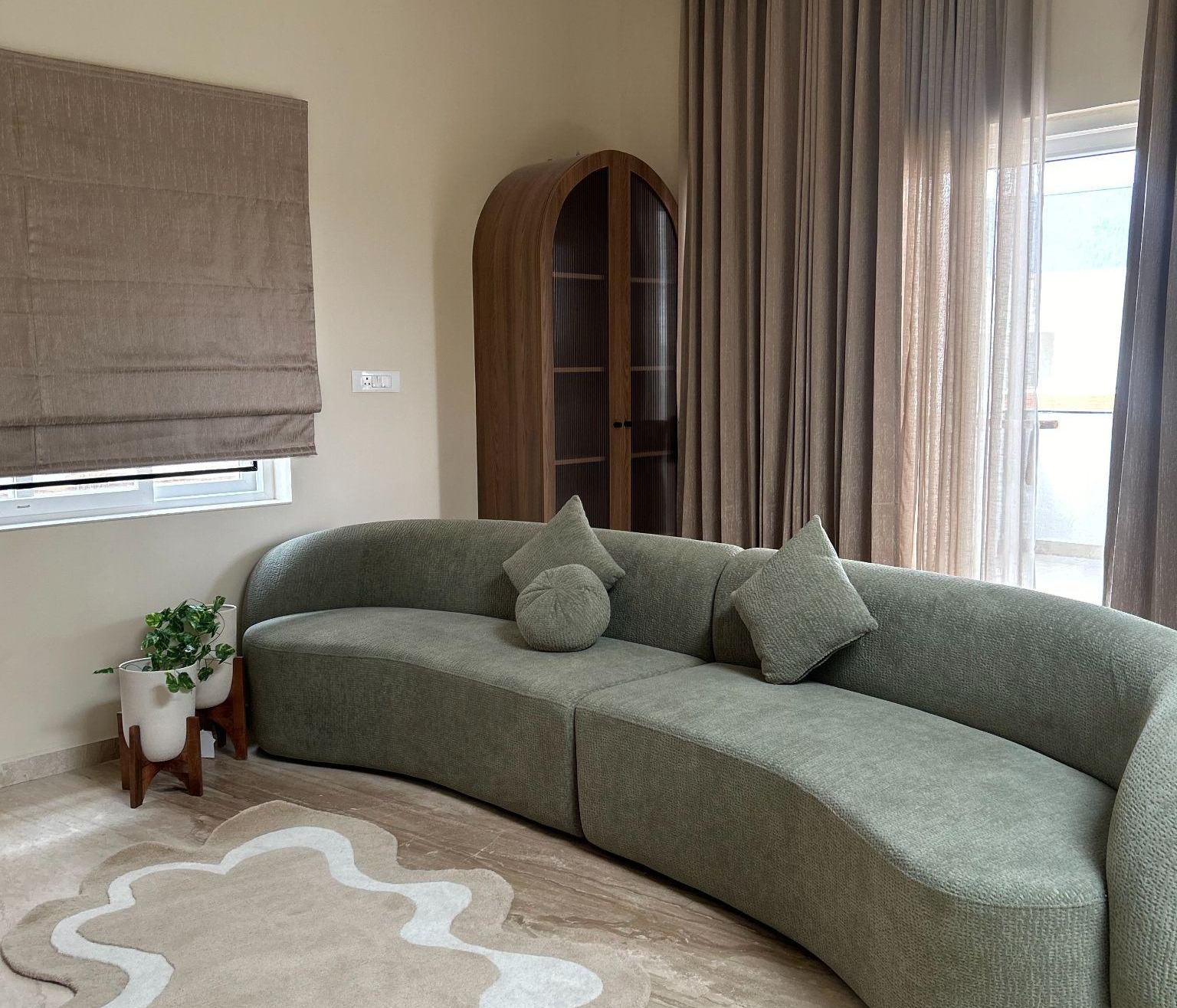
Rendered vs Actual Execution
The idea survived the journey to site.
The strongest proof of execution is not a single hero photograph. It is the consistency between the approved 3D direction and the completed rooms - across living, kitchen, bedrooms, wardrobes, study and family spaces.
A cohesive home, built with restraint.
The residence reflects Akarsh Designs’ approach: understand how a family wants to feel at home, translate that into a clear design system, and protect the intent through execution.